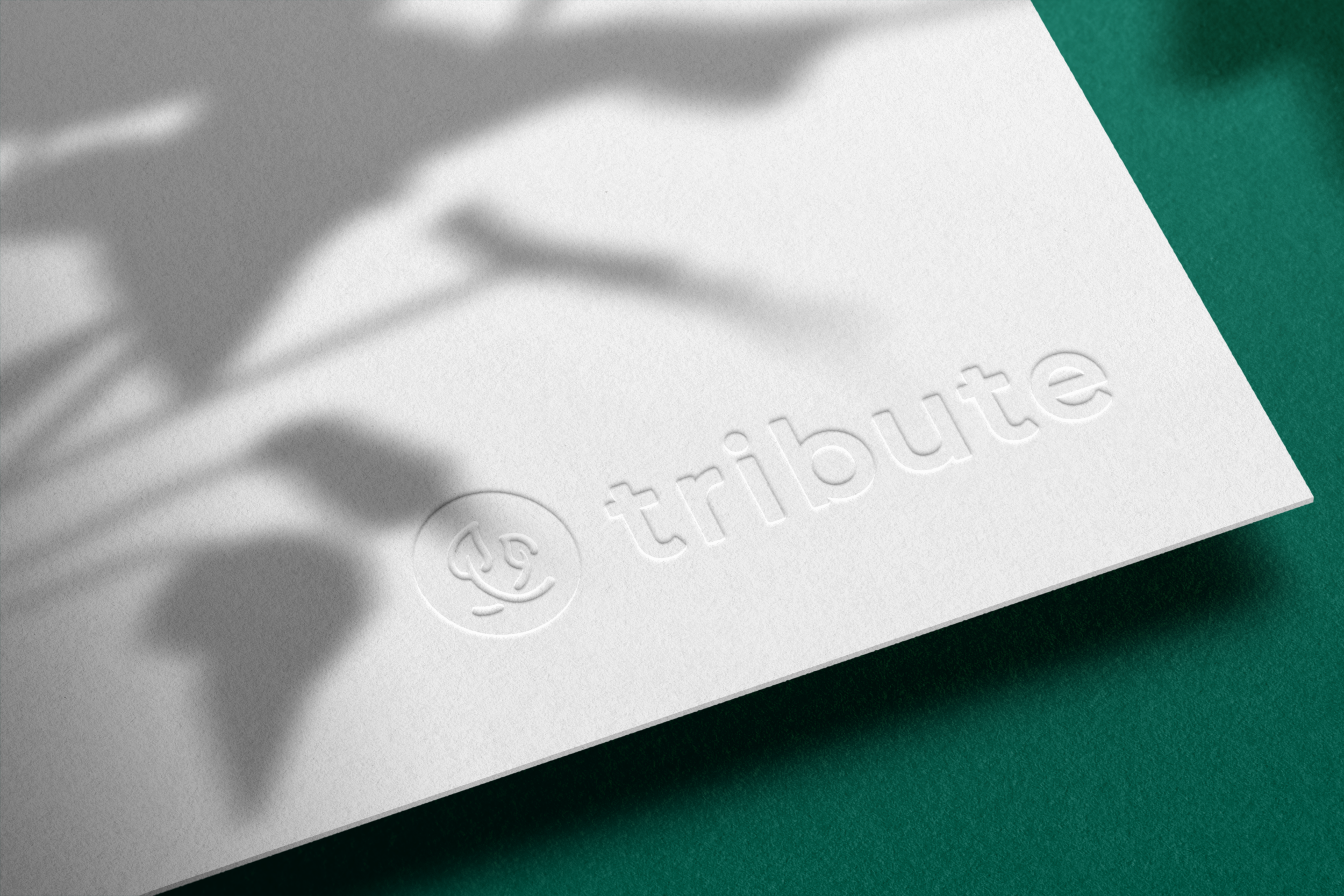
Evolving Tribute’s brand
Tribute is an employee-centric app that connects employees to the right colleague at the right time, helping them find mentors and advisors with similar experiences, skills, and aspirations. Ultimately empowering them to feel more connected while fueling their career journey. See the full product design here →
CLIENT: Tribute
ROLE: Co-founder, VP of Product & Design, Tribute
In its early stages, Tribute catered to a specific market, demographic, and business model, initially focusing on providing support for women in the workplace. However, as the platform evolved into a more comprehensive knowledge directory facilitating broader connections within organizations, it became evident that our brand identity needed to evolve, too.
The solution? Maintaining the essence of our identity while infusing it with renewed vigor. We retained the symbolic elements of our original logo while optimizing the balance between symbol and wordmark, resulting in a more robust visual representation that resonates with our evolving mission.
As our team often emphasizes, "When you grow, we grow."
With this refreshed logo, Tribute's brand now commands attention whether it's showcased in partnerships, sponsorships, or on company merchandise.
Ensuring consistency across various platforms was key. The redesigned Tribute icon seamlessly scales across Web, Slack, and Microsoft Teams, enhancing brand recognition and delivering a cohesive product experience.


